SECTOR ROTATION MODEL … One of our readers asked where we are in the Sector Rotation Model. That model shows the normal sector rotation that takes place at various stages in the business cycle. The chart shows that basic materials and energy are market leaders at a market peak. As the economy starts to slow, money starts to rotate out of those two inflation-sensitive groups. Basic materials peak first and energy last. This week’s downturn in basic material stocks suggests that the topping process is moving even further along. Energy may be the next to roll over. As the economy slows, money flows into consumer staples, healthcare services, and utilities. That’s where we appear to be right now. One way we can tell that a bottom is near is when money starts to flow into financial and consumer discretionary stocks. So far, there’s no sign of that happening. That leaves us in the midst of a bear market with money flowing toward staples, healthcare, and utilities.
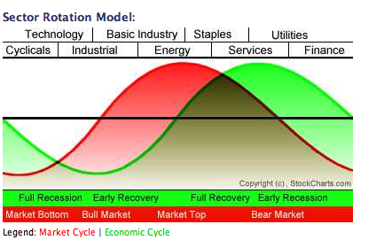
Chart 6
STOCKS ALWAYS PEAK BEFORE THE ECONOMY … Every time I show the Sector Rotation Model in Chart 6 I feel the need to point out that the stock market (red line) peaks well before the economy (green line). Although most of us are aware that the stock market is a leading indicator of the economy, that point keeps getting lost on Wall Street and the media. Ever since the market peaked last fall, the media has presented a parade of economists arguing that the economy was still on sound footing. I remember seeing a headline “fear versus fundamentals” back in January (that was repeated again this week on CNBC). The implication being that the market was falling on “fear” instead of “fundamentals”. With the stock market having had one of the worst first halfs in decades, we’re now getting confirmation that the economy is in bad shape. It’s a little late for that to do anybody any good. That’s why we study the market and pretty much ignore the media and Wall Street economists. They’re always behind the curve at important tops because they insist on following the green line in Chart 6. We follow the red line which has been falling for nine months.


